Color Revolution: Unlocking the Secrets to Simplified Color Mixing
- Taelynna Rowan

- Mar 31, 2025
- 4 min read
Updated: Apr 15, 2025
I've been going on quite the artistic journey this year. I didn't start out an artist in the traditional ways. I'm a former English teacher and other than time in elementary and middle school, I haven't spent any time in a classroom dedicated to learning how to make art.
My lack of knowledge in art mostly frustrates me when I'm mixing colors and I just can't figure out how to get the color I want. I feel like I'm in elementary school again and the teacher is showing us how to make orange and I'm getting nice burnt oranges of fall and murky brownish oranges, anything but a nice vibrant orange.
Out of a little bit of frustration and a lot of desire to understand I did a bit of a dive into the internet to learn more about why I have such issue with color and it turns out I'm not the only one. Apparently a lot of people struggle with the exact same thing.
In elementary school we're taught a very simplified version of color. Red and yellow make orange. Yellow and blue make green. However nature doesn't really have pure colors like the red and yellow in this idealized version. Our pigments, and therefore our crayons, markers and paints are make up of mostly red, but a little blue is in that red too. And the yellow that we're using is mostly yellow, but a little bit of blue is in that too. So when we try to mix that red and yellow together to make orange, there's more blue in there than we intended and the color looks murky.
It was difficult for me to really understand until I started playing around with the colors on my watercolor palette. I decided to use one of my old watercolor sets and just create a grid to combine the different colors and I tried to predict whether each color would lean one way or the other.

My first three colors were all reds and pinks so I needed to predict whether they would lean blue or yellow. Basically, when I mix each of these reds, would it look brighter and more saturated with bright color or would it start to take on a greyer hue and look dully or muddy?
For my yellows I predicted whether they leaned red or blue. Finally, my two blue colors I did the same for whether they would lean yellow or red.
About half way through I realized I was wrong with my prediction on the pink and changed my prediction, later confirming with just how pretty those purples on the end were.
I think I may struggle with my yellows still. They both seem fairly neutral to me to be honest, creating really pretty and vibrant colors. The top seems to lean more red only because the bottom one made such a beautiful cyan green.
Rather than take it for granted that I am going to be able to create a beautiful color on the page, I've begun doing additional color studies with watercolor paint I am creating at home. I wanted to both understand how each of the colors I'm mixing combines with other colors and also try to create a simplified color mixing guide that others who struggle would be able to understand.
I've selected some colors I felt mixed well together to create a Color Revolution ATC guide that will be included in the ATC Portable Kits we'll be selling soon.
I wanted to create something that could help other people understand better how to combine colors to create more vibrant and less muddy looking art.
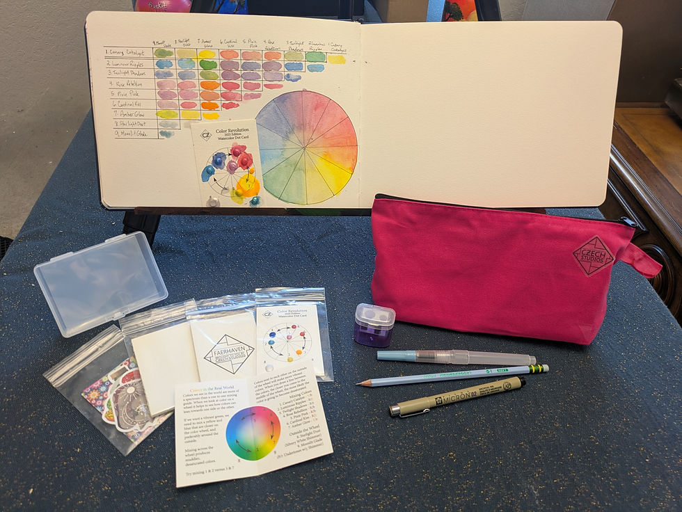
Below are the colors and the order they appear around the color wheel. I suggest trying out mixing the colors in different ways to see how mixing around the color wheel can give you more vibrant colors, while mixing across makes muddier or greyer colors.
Canary Catalyst
This yellow is able to make some really beautiful greens when mixed with a yellow leaning blue. The oranges it's able to create are a bit peachier in tone than a vibrant orange.
Luminous Ripples
This blue leans yellow, so purples created with it range from dusky to grey in tone while greens will be more vibrant.
Twilight Shadows
This blue leans more red. You can mix it with the other blue to get some lovely shades of blue, but trying to mix it with Canary Catalyst will result in a dull murky greenish grey. Instead, you want to mix towards the red side with either 4 or 5 which both lean towards blue.
Rose Rebellion
This red leans more blue, but the most vibrant purple will come from mixing it with the blue that leans red (3). The other blue will create a duskier purple. Mix around the wheel for vibrancy, not across it.
Pixie Pink
This pink leans towards blue so it makes a really vibrant lavender.
Cardinal Kiss
This red could lean more yellow still to create a more vibrant orange, but when it's mixed with 7, a yellow that clearly leans red, it makes an orange that pops.
Amber Glow
This watercolor is not made with mica, so it's missing the luster of the other pigments, but it does glow under black light pretty brightly even when mixed with another color. This yellow leans red so it will make more vibrant oranges, and murkier greens.
Starlight Dust
This pigment will add a lot of shine and mixes really well to create lighter, more pastel versions of the colors you mix up.
Moonlit Glade
This pigment has more of a blue undertone despite it's green and teal sparkle and is ideal for using as an accent to add the special multi-toned shimmer.
I've included a picture of my color chart, created from the watercolors included here. I'd love to see what everyone else comes up with too! Share it here, or tag me on Instagram and use #colorrevolution.

Comments